JPutt927
Authors
Duke
 
Merit: 32
 Offline Offline
Posts: 199
Conquering the world...One tile at a time.

|
 |
« Reply #15 on: July 19, 2009, 04:42:57 pm » |
|
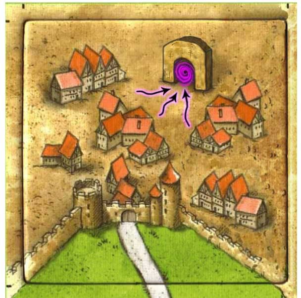
Well, I went back to the drawing board...just for the sake of having another option. I tried sticking more to the "fantasy" theme, more along the lines of the Princess & the Dragon. Here's what I've come up with... Let's get some opinions!  |
|
|
|
« Last Edit: July 19, 2009, 06:18:51 pm by JPutt927 »
|
 Logged
|
|
|
|
|
Whaleyland
|
 |
« Reply #16 on: July 19, 2009, 05:20:59 pm » |
|
Definitely like it more, although I didn't mind the craziness of the old version. But this one is definitely more in-theme. If you can try and find a way to make the portal stand out without needing the arrows, that would be ideal, methinks.
|
|
|
|
|
 Logged
|
'There is no place in a fanatic's head where reason can enter'.
- Napoleon Bonaparte I, Emperor of the French (1804-1814, 1815)
|
|
|
JPutt927
Authors
Duke
 
Merit: 32
 Offline Offline
Posts: 199
Conquering the world...One tile at a time.

|
 |
« Reply #17 on: July 19, 2009, 06:20:10 pm » |
|
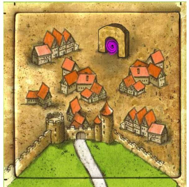
For comparison's sake, here's one without the arrows. I'd like to hear what some others think about the arrows.  |
|
|
|
|
 Logged
|
|
|
|
CKorfmann
Authors
Duke Chevalier
  
Merit: 32
 Offline Offline
Posts: 1807
Pigs are meeple too!

|
 |
« Reply #18 on: July 19, 2009, 07:07:01 pm » |
|
This is an excellent alternative. I think there are pros and cons to the arrows. They certainly remind me of the magic portal (I assume that's where you got them) and I think that goes a long way toward helping people understand the concept before they even hear what it is. However, I also think it might look better without the arrows. You are certainly talented my friend! I really like the portal! I think with the space available on that tile, I'd be interested to see what it looks like if you increase the size of the portal itself, maybe even by half, and if we keep the arrows, maybe decreasing their size. They might be OK viewing the tile at normal size. I'm having a bit of trouble picturing it "life size" with your image as big as it is. My brain can't seem to make the translation. Although, it certainly does make it very easy to work with. Thanks for weighing in on this one Whaley (or in your case, should that be "whaying" in?) I'm corny, I know!  I kinda wish more people provided their comments more regularly. |
|
|
|
|
 Logged
|
Flee the fleas!
|
|
|
|
Whaleyland
|
 |
« Reply #19 on: July 19, 2009, 07:19:30 pm » |
|
You're welcome. I too think it would look good slightly larger, maybe with some runic symbols or something around the arch. I still stand by not having arrows, though. Perhaps moving the portal closer to the center (and moving the buildings out of the way or removing them) would also help. For some reason, I am visualizing something like the portals in Diablo II or in Harry Potter and the Order of the Phoenix. Also, JPutt, can you sample a size of the tile for us that is the actual size? I believe that is like 80x80 pixels but I can't quite remember.
|
|
|
|
|
 Logged
|
'There is no place in a fanatic's head where reason can enter'.
- Napoleon Bonaparte I, Emperor of the French (1804-1814, 1815)
|
|
|
JPutt927
Authors
Duke
 
Merit: 32
 Offline Offline
Posts: 199
Conquering the world...One tile at a time.

|
 |
« Reply #20 on: July 19, 2009, 08:05:14 pm » |
|
|
|
|
|
|
 Logged
|
|
|
|
CKorfmann
Authors
Duke Chevalier
  
Merit: 32
 Offline Offline
Posts: 1807
Pigs are meeple too!

|
 |
« Reply #21 on: July 19, 2009, 08:56:37 pm » |
|
Looks good! Larger is definitely an improvement. Not sure how I feel about the arrows though. I'm torn because of the association factor. Maybe we'll get lucky and get a few more insites to help us make a decision.
|
|
|
|
|
 Logged
|
Flee the fleas!
|
|
|
JPutt927
Authors
Duke
 
Merit: 32
 Offline Offline
Posts: 199
Conquering the world...One tile at a time.

|
 |
« Reply #22 on: July 19, 2009, 09:02:42 pm » |
|
I'm completely torn on the arrows as well. I sure hope we can get more thoughts to help make the decision even the slightest bit easier. So, if you're reading this!...arrows or no arrows? Thoughts please!  |
|
|
|
|
 Logged
|
|
|
|
Bubbasco
Cottager
 
Merit: 2
 Offline Offline
Posts: 16

|
 |
« Reply #23 on: July 19, 2009, 10:34:36 pm » |
|
In regards to the arrows, after much consideration, I personally feel that no arrows is slightly better. My reason is that the wormhole goes both ways, not just inward. Since the arrows are only pointing in one direction, it does not seem to follow with the theme of the tiles, which is the city has a portal connecting it to another city in which travel between the two would flow in both directions. Kind of a semi-scientific view, but one that helped me settle the debate personally. Nice pictures!!!
|
|
|
|
|
 Logged
|
|
|
|
CKorfmann
Authors
Duke Chevalier
  
Merit: 32
 Offline Offline
Posts: 1807
Pigs are meeple too!

|
 |
« Reply #24 on: July 19, 2009, 11:29:25 pm » |
|
In regards to the arrows, after much consideration, I personally feel that no arrows is slightly better. My reason is that the wormhole goes both ways, not just inward. Since the arrows are only pointing in one direction, it does not seem to follow with the theme of the tiles, which is the city has a portal connecting it to another city in which travel between the two would flow in both directions. Kind of a semi-scientific view, but one that helped me settle the debate personally. Nice pictures!!! You've got a point there. I did actually consider that and wondered if we should put arrowheads on both ends, but decided that would look funny. Anyway... Welcome to the forum! Let me know via PM if I can help you find your way around. |
|
|
|
|
 Logged
|
Flee the fleas!
|
|
|
JPutt927
Authors
Duke
 
Merit: 32
 Offline Offline
Posts: 199
Conquering the world...One tile at a time.

|
 |
« Reply #25 on: July 20, 2009, 08:54:14 am » |
|
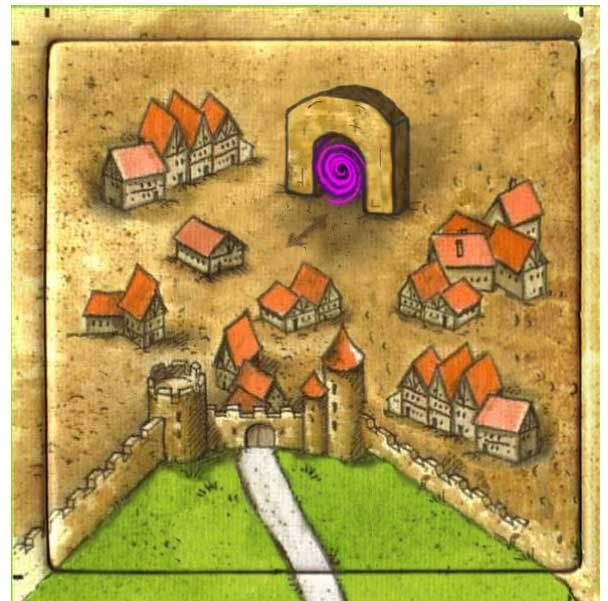
Well, it sounds like the "P&D" arrow's are out! So, here's one more design to discuss... it's as if the arrow has been drawn by the townspeople into the ground in front of the wormhole.  |
|
|
|
|
 Logged
|
|
|
|
Lavendel
Vagabond

Merit: 2
 Offline Offline
Posts: 8

|
 |
« Reply #26 on: July 20, 2009, 09:00:16 am » |
|
I don't know if a wormwhole or similar can be even imaginally interpreted out of some medieval story, but I find the purple colour too "modern" looking.
Couldn't the spiral be more dark brown + white? I don't want anyone to associate with neon, nightclubs or anything else unholy.
|
|
|
|
|
 Logged
|
|
|
|
CKorfmann
Authors
Duke Chevalier
  
Merit: 32
 Offline Offline
Posts: 1807
Pigs are meeple too!

|
 |
« Reply #27 on: July 20, 2009, 11:35:08 am » |
|
I love the arrow! It's 10 x's better than the others. As to the purple color, I think it makes the tile pop. This is important for it's use. If you're playing mege-Carc with 300+ tiles, you need to find these two tiles quickly and easily.
Did you do the layer thing on this one too? The swirls look like they have some depth.
Welcome to the forum Lavendel!
|
|
|
|
|
 Logged
|
Flee the fleas!
|
|
|
|
Joff
|
 |
« Reply #28 on: July 20, 2009, 11:44:50 am » |
|
Well, I like the new tile designs much better than the first. I quite like the double headed arrow, but I am also think the neon purple is too bright.
|
|
|
|
|
 Logged
|
|
|
|
|
Whaleyland
|
 |
« Reply #29 on: July 20, 2009, 01:10:21 pm » |
|
I like the new arrow. Much more in-style. I'm indifferent concerning the color. Overall, the expansion is looking much better
|
|
|
|
|
 Logged
|
'There is no place in a fanatic's head where reason can enter'.
- Napoleon Bonaparte I, Emperor of the French (1804-1814, 1815)
|
|
|
|


